Let's Coach is a service that makes barter coaching more convenient and accessible.
They empower coaches by helping them gain confidence in their new skills, getting them certified to start their own business and continue to help individuals around the world.
As a first step of their brand journey, they needed a web style guide to establish the foundations for their platform before moving on to UI / UX development.
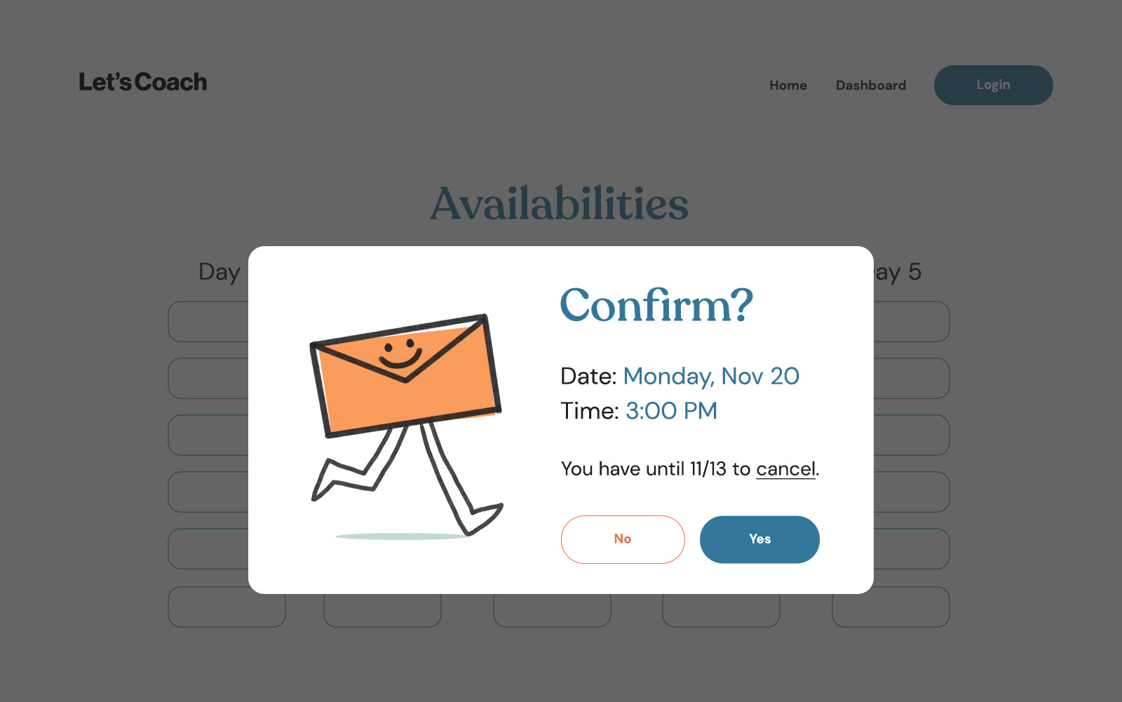
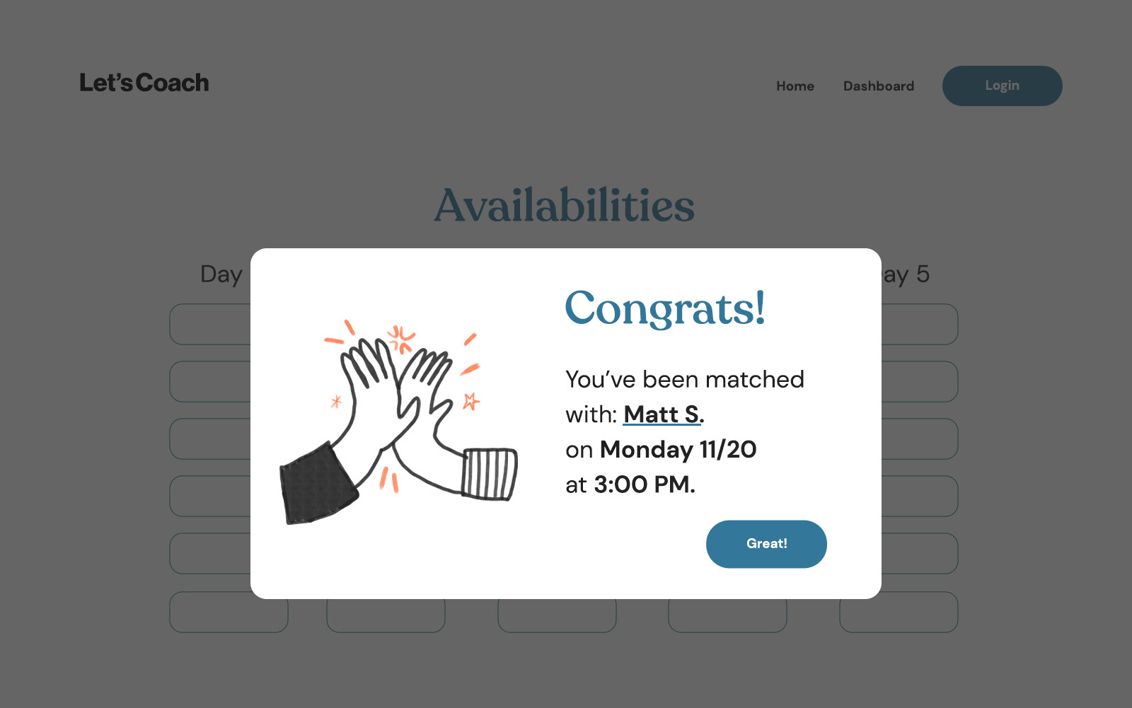
The brief called for a clean but playful treatment: "Unpolished. Not perfect. Vulnerable" were some of the key words that kept coming up in our conversations.
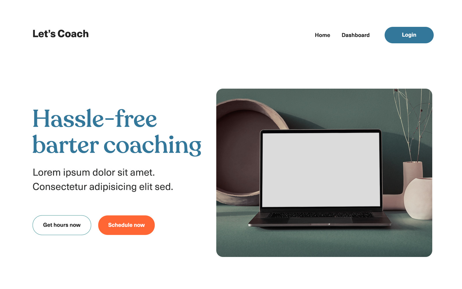
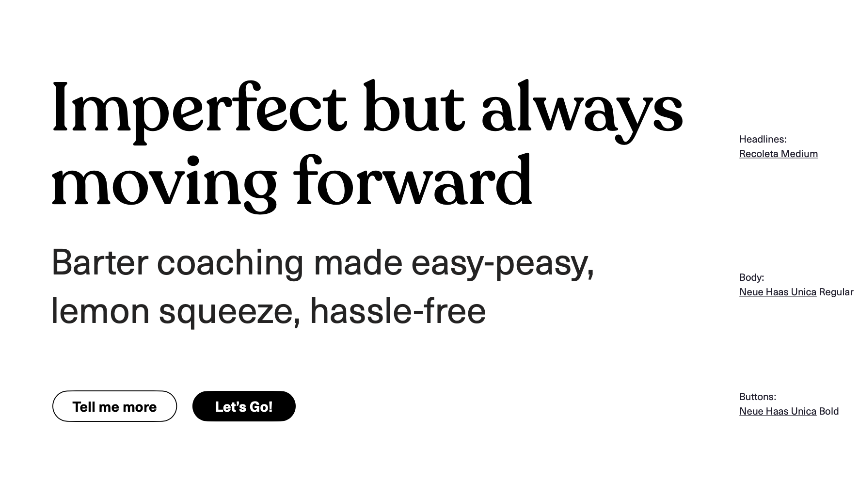
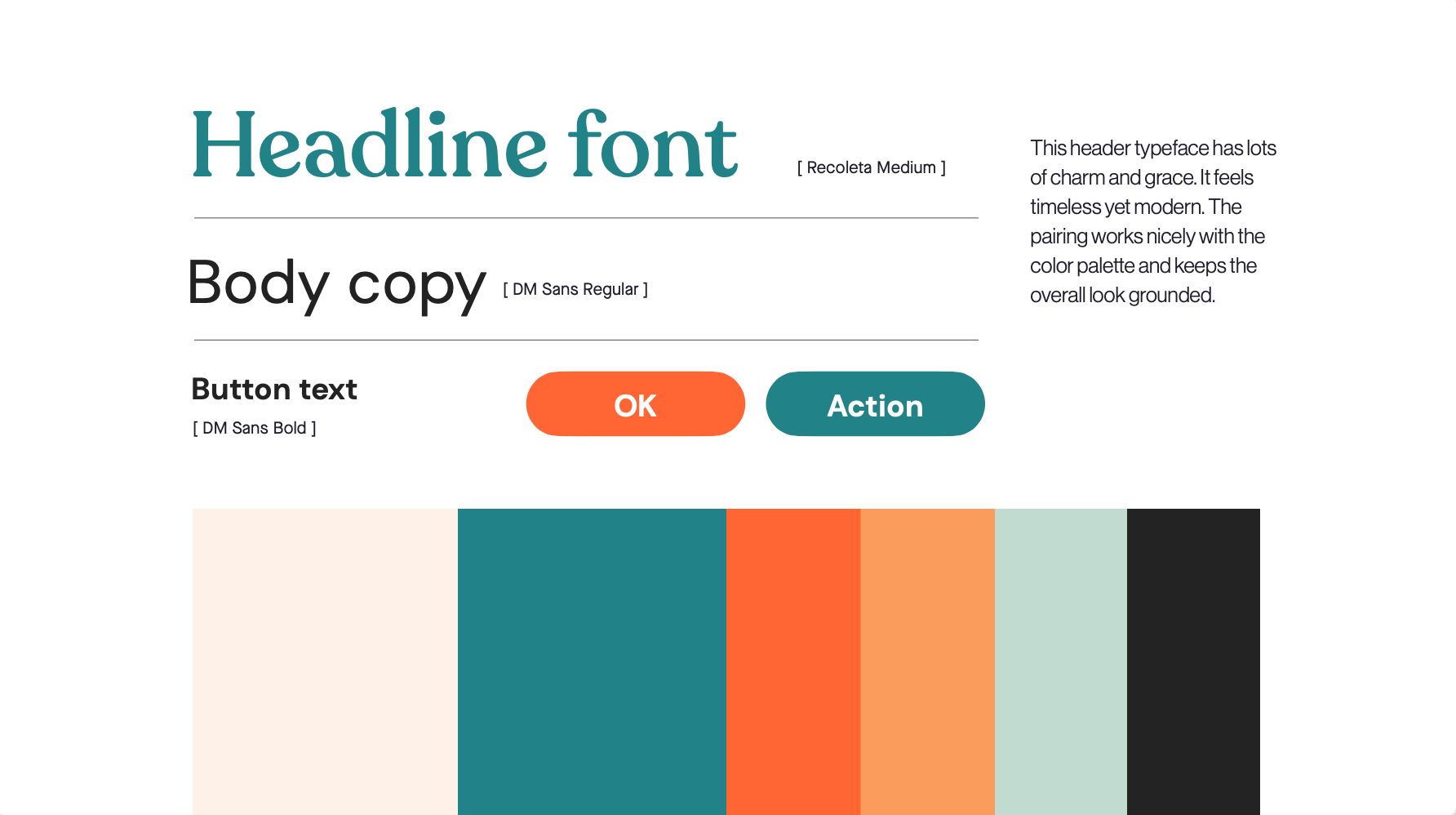
Polished yet decidedly not corporate. The color Palette is fresh, friendly, and unique.
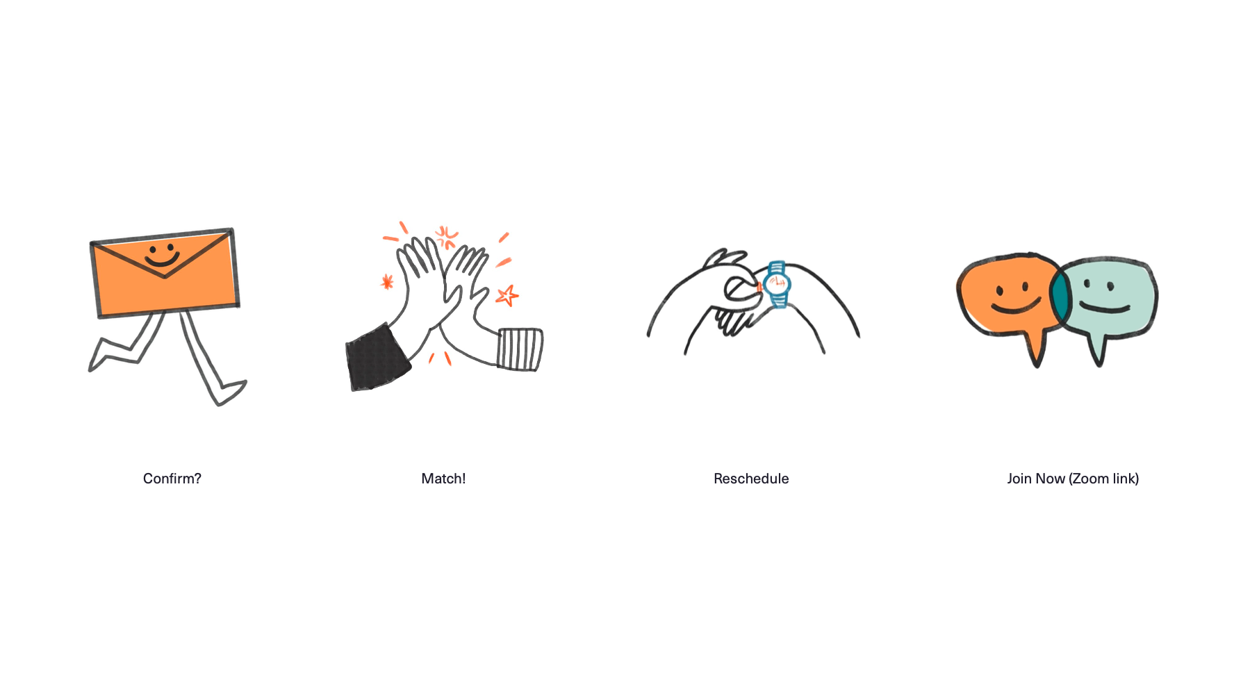
Imagery style was perhaps the most important aspect of the visual style. We initially explored collage, photography, and 3D illustrations, but we quickly realized the imagery needed to be imperfect and human to be aligned with their brand ethos.